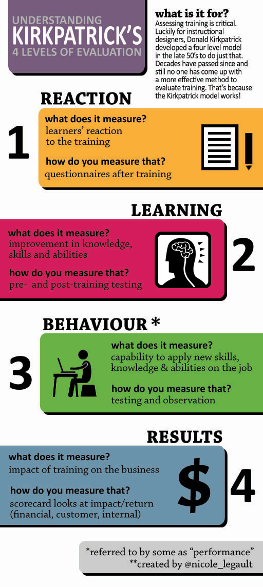
I have created a visual representation of Kirkpatrick’s Four Levels of Evaluation model, boiling it down to its’ most simple form.
- Comment
- Reblog
-
Subscribe
Subscribed
Already have a WordPress.com account? Log in now.

Yes. a good effort to simplify and illustrate visually. Can be used as a sum-up/conclusion slide.
You said this was your first infographic so here is some (hopefully helpful) feedback to make the next one even better.
I would use a smiley face for Level 1 (commonly called a “smile sheet”) and perhaps a brain icon in plase of the “KSA” for Level 2. Level 2 really only measures K (knowledge) so not only does it miss the graphic opportunity it is not entirely accurate.
Thanks Jerry! Very helpful advice – it was my 1st infographic – but regardless of that, I think feedback is always good since there should always be room for improvement.
Really good idea with the brain icon – i wish it would have come to me when i was deciding what graphic should represent that level.
Love the Graphic…Not a fan of KP model…I have a problem with Level 1….Its an administrative burden that does not produce any credible return on investment….I will expand…It can be, and is often, influenced by trainers such that it has little value and tells you very little…Other than a warm glow for the trainer, this becomes a process rather than a measure…..Refered to as a Happy sheet, suggests just that, most are happy and those that are not do not reveal real feelings……I would scrap all level 1 and start at level 2…i.e. has it made any difference in output…..I would suggest that we have become so conditioned to the model, that we can not see beyond it…Great graphics as I said
Love your infographics Nicole, have just “pinned” this and the adult learning principles one. Thanks 🙂
Thank you kindly Michelle! 🙂